Mickeleh's Take: Funny how the Web, which is a medium of sight, sound, motion, and type relies almost completely on headlines to stop and grab an audience, where magazines can sell through the power of image and design. Look through the top forty and notice how many are image-only and image-mainly. Walking past a newstand, the image will pop more than type. (Current practice is to add a bunch of headlines to help close the sale after the browser has been stopped by the visual)
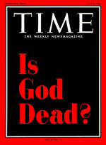
From the ASME selection here's the big exception:
 By contrast, the Web and the blogosphere still rely on mainly type. It's headlines that sell, not images. Images are enhancements. Even after the 2006 explosion of the audio-visual web, podcasts and videos, we still graze headlines. The most powerful and lucrative ad format on the Web is a still the Google ad—a short headline, two lines of copy, and a URL. Sites that attempt to go pure visual and heavy Flash turn out to be tedious and ponderous. (When I see "loading..." I translate it instantly into "leaving...")
Is list-scanning inevitable in the Web world? Is anyone doing a visual browsing experience that you like?
(Tags: Media, Magazines, Design, Web Browsing, Advertising)


0 comments:
Post a Comment